Yes. I totally agree that google search gives much better results than Orchid’s search–that was sort of my point…:-)…
Orchid search seems to have been designed by a graphics person who does not do metal research.… It’s very pretty. But totally dysfunctional for the serious user. Let’s take a look at the person search you sent me:
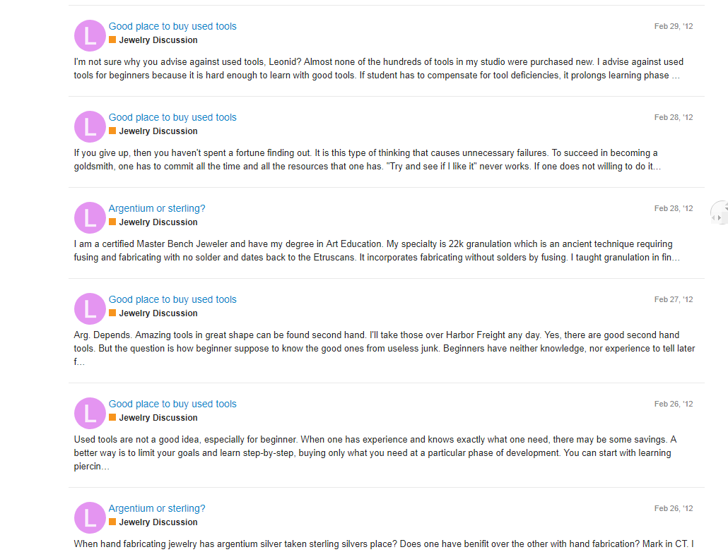
There is a separate, very large entry for each post of each thread: 12" wide by 2" high. I only get six to a screen. I have to scroll to the bottom and wait a long time for more to upload. I have been scrolling and waiting for a looong time now and I only got to 2013! I don’t need the large logo of the poster or a link to the general category. I don’t know how the first two lines of the post are useful–they can’t tell us anything about what is in the rest of the post or the thread. The first 2 lines may not be relevant, while the rest of the post may have just what we are looking for. In the case of lists of posts, I would want only the name of the thread and the name of the poster to appear, so we could get as many threads/posts as possible on one screen. (Further clarified below)
In the case of a person search like the Example link you sent me, the Topics layout under Activity is close to what I need. But it only gives 11 threads for Leonid–a small fraction of his contributions. Having to know all of everyone’s past emails is not a reasonable requirement for a search engine to give what would normally be considered standard results…:-)…
In the case of an issue search, I, personally, found the old system perfect and the present system literally not usable…:-(… In the old system, I could put in a topic/word/phrase and get a list of relevant threads. Each line contained only the name of the thread. Indented under that line was a list of posts in the thread showing the name of the poster:
THREAD TOPIC (one line of small text)
Name of poster -date
Name of poster -date
Name of poster -date
THREAD TOPIC (one line of small text)
Name of poster -date
Name of poster -date
Name of poster -date
[I can’t make the names indent.]
So you could see in a split second what the thread is about, how long it is, who participated, and how much your favored people participated. In short, everything you need to know to decide if you want to go read the thread.
Crucial point: When you have to skim through large numbers of entries (be it threads or posts), having each entry take up only one line is crucial! Small print, with no spaces between the lines.True, it’s nowhere near as pretty as your present results page. But it let’s you find what you are looking for because it lets you run through a lot of info very quickly.
Ironically, the old setup turned out to be much more functional because it was so simple–no formatting, just plain text…:-)… I think I can honestly say that the present setup is in effect unable to allow us to search the earlier years of Orchid because it takes endless scrolling and waiting and then endless scrolling back and forth. I know how to use it but don’t. I’ve reviewed the issue because I always refer a student of mine to the Archives but she says she is unable to get to the info. I doubt if she is the only one having this problem.
The designer of a search system should watch an average user actually using it. Things that are ‘obvious’ to the designer are often totally unseen by the user. And vice versa. I tend to like everything to be aesthetic…except search systems, if it’s at the expense of function.
Janet in Jerusalem
PS The search results pages are very beautiful!
 We’re trying our best here for sure.