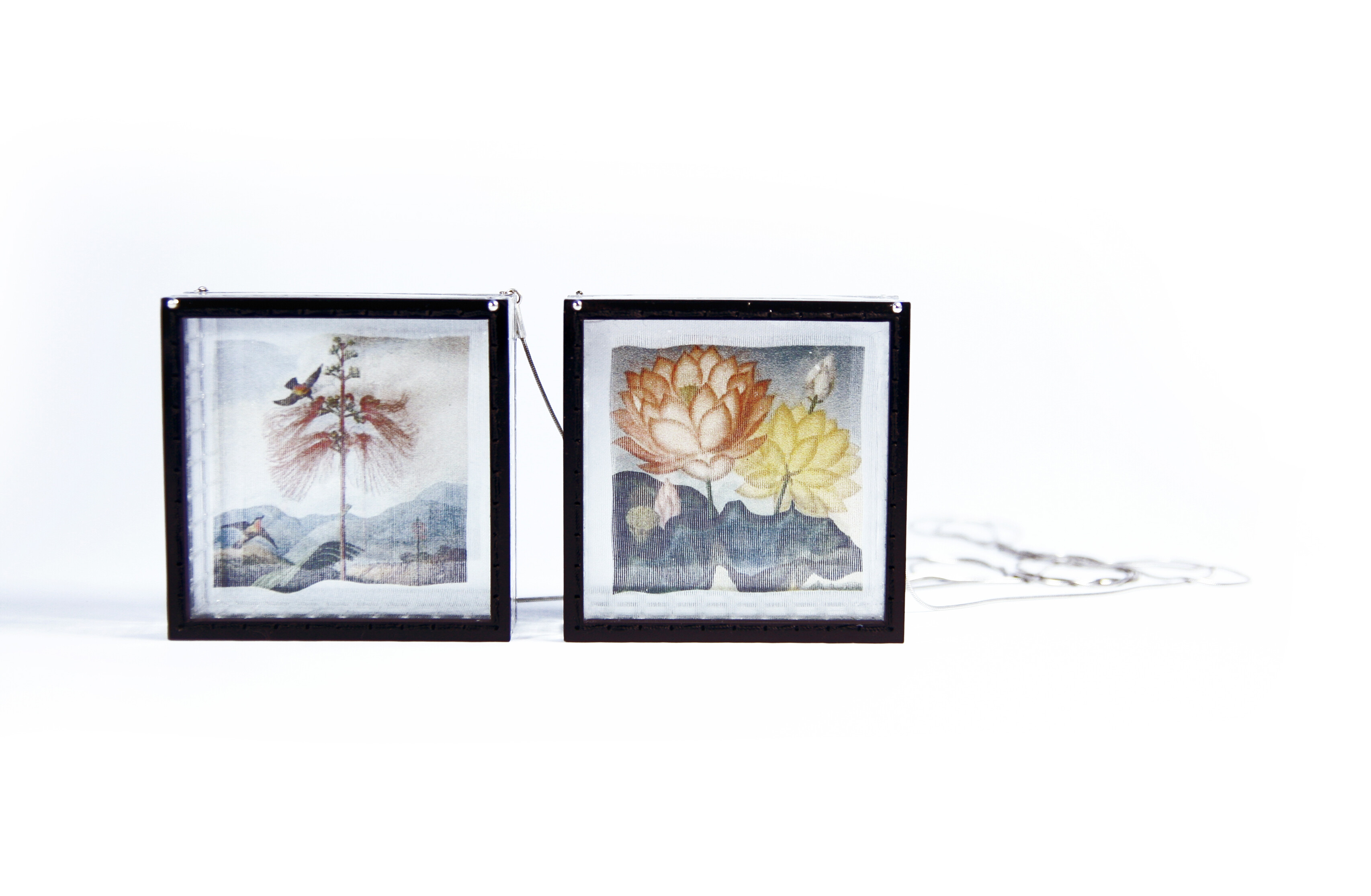
Materials: silver, silk, plexiglass, steel
Dimensions: 8cm x 8cm x 8cm
this square box has inside a special mirror that emphasizes the color of the flowers digitally printed on silk, creating a very coloured picture.
Photo credit: Umberto Puca
Chiara Scarpitti
Chiara Scarpitti Studio
Naples, Italy
Designer and researcher, specialized in contemporary jewellery.
Her works develop on different levels of the contemporary, hybridizing the technology with a humanistic approach, using the most innovative production techniques between advanced industry and high craft.
Statement
The composition technical and aesthetic of artifact becomes metaphorical model for the recostruction of social and political world. There's an attempt to reflect, from an antropological point of view, about the sense of materials, tecniques, shapes. The jewel is in a dialectical relationship with the poetic and visionary dimension of us, and becames concrete action in the reality of all days. The works bud from a crossbreeding of materials and techniques, both digital and handcrafted. The same mixing is made between different tecniques as haute couture tailoring techniques, digital prints, industrial chemical cut, laser cut, rapid prototyping. All is finalized to investigate a new kind of contemporary jewellery as intersection point between design and art, craftsmanship and industry, humanity and technology.
Education
Currently she is PHD student at the International Doctorate in Design and Innovation at the Second University of Naples with a design research which hybridizes Digital and Humanities. She has taken a Master's Degree in Fashion Design at Politecnico di Milano with a thesis about contemporary jewellery and a Bachelor's Degree in Industrial Design at Second University of Studies of Naples. From 2007 she is design and graphic consulent for external design companies. From 2010 to 2011 she held an internship at the Giancarlo Montebello Body Ornaments' studio in Milan. From 2003 to 2006 she collaborated at the Riccardo Dalisi's studio in Naples. From 2007 she is member of AGC-Association Contemporary Jewellery and ADI-Association Industrial Design. From 2003 she research, development, design contemporary jewellery and products in limited editions.
Exhibitions and awards
She has won many contemporary jewellery awards like "Preziosa Young" in Florence, "The best of Bjoux" in Milan, "Cominelli Fondation" in Sal?, "Enjoa't" in Barcelona, "IJA Italian Jewellery Award" in Naples, and others.
She had solo exhibitions at the International Forum of the Culture in Naples, at the Plart Design Foundation in Naples, at the Verrengia Gallery in Salerno and abroad Italy, at the Expo Arte gallery in Oslo, at the Beeld&Aambeeld Galerie in Netherland.
She has partecipated to many collective exhibitions in Milan, Rome, Florence, Naples, Venice, Padua, Trieste, Turin, Paris, London, Munich, Bristol, Barcelona, Antwerp, Frankfurt, Amsterdam, Mexico City, San Francisco, Taipei, Melbourne and many others.
The exhibition explores metal works whose primary theme is color embraced as their primary visual focus, whether that be using colored materials, exploring creating colored surfaces, or encasing the object in color.
As the world's largest jewelry related internet site, Ganoksin strives to develop exhibitions showcasing work from around the world. This exhibition was open to all metalsmiths, professional and amateur, advanced and beginner.
In total 303 artists contributed 814 show pieces for the permanent online exhibition.
The exhibition was curated by Beth Wicker, President of the North Carolina Society of Goldsmiths in the United States, and Adjunct Instructor at Northeastern Technical College in South Carolina. Director of the exhibition is Hanuman Aspler, founder of The Ganoksin Project, the world's largest internet jewelry site.
Hue is one of the primary properties of color, it refers to the place the color occupies on the visual spectrum. Humans have used hues throughout time, to create cave paintings, to decorate themselves, their clothing and their housing.
Different hues have taken on different meanings throughout time. Gold traditionally has been a color of purity - the metal gold is relatively unchangeable, and the hue of gold has come to stand for gods and goddesses, for royalty, for durability and for purity. Red has often meant love, or passion. Hues often reflect the meaning of the seasons, with pastels referring to spring and the burst of new life after the pale hues of winter. Summer is reflected in vibrant, deep hues, followed by the browning of hues in the fall as plants go to seed and die, and the land turns fallow.
The worth of a hue has often been tied to what is necessary to make the pigment that creates the hue, and the expensive involved in the process. Often created from crushed stones that had to be mined and carried by caravan over thousands of miles, or from fermented roots of plants only grown in certain areas, or the carapaces of rare insects - the creation of hue in a way that could be used by man was an involved and generally expensive process.
In today's world metalsmiths have access to perhaps the widest range of materials and hues in the history of man - and in some of the most affordable ways ever.
This exhibition celebrates hue - color - as an integral, inherent element of the work. We talk of the "richness" of color, and examples of this abound here. One expects hues from the colors of gemstones used in metalsmithing, but we also have hues from some less expected places. Glass enamels are an ancient way of adding color, as are a variety of patinas. Today's artists also use synthetic man-made materials to add color in ways that didn't exist a century ago.
We invite you to enjoy this celebration of hue, and the ways hues and their use have changed over time.