Brooch - Changing Hues

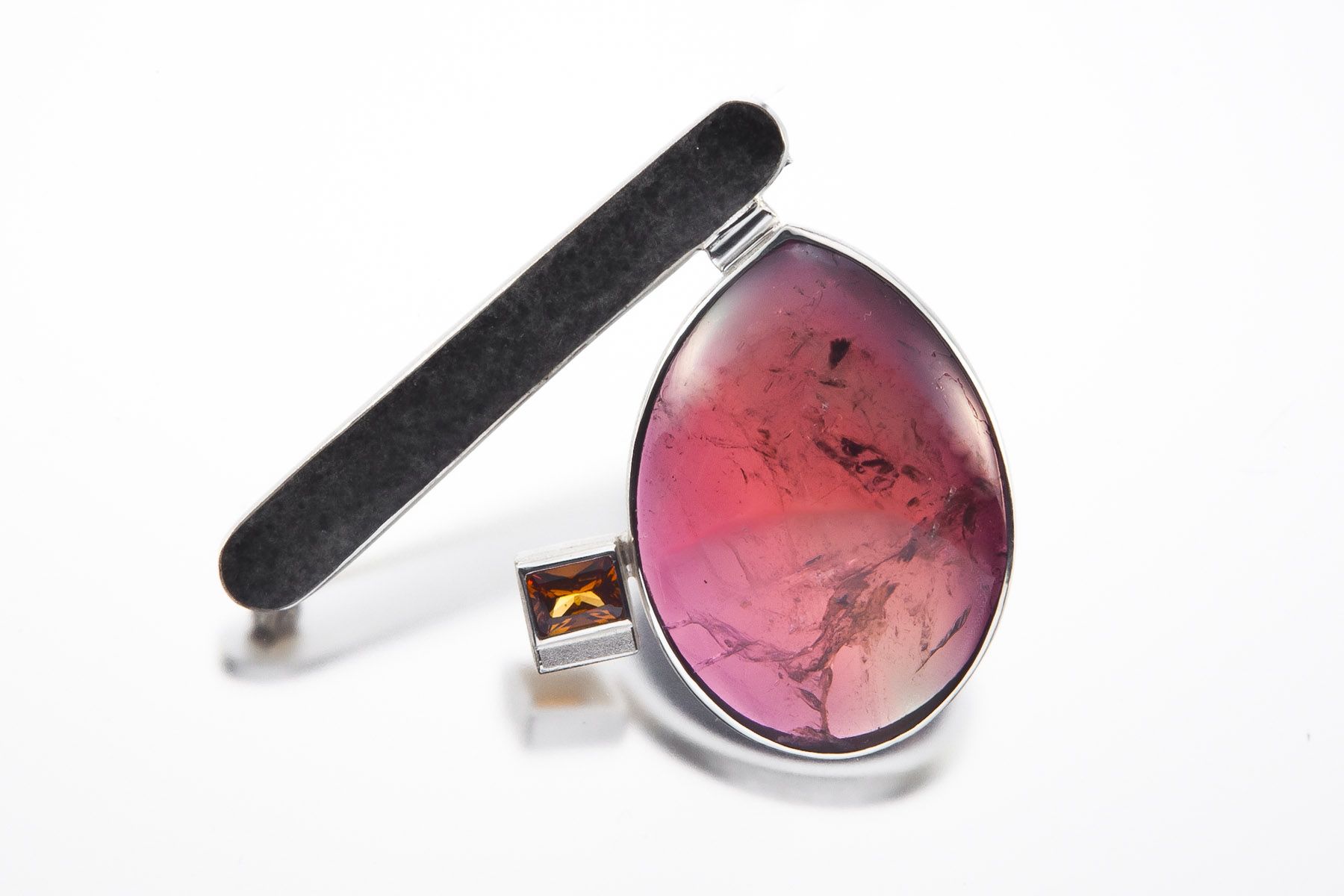
Materials: Porcelain, silver
Dimensions: 7x6.5 cm

Porcelain handbuild shape is enclosed in lost wax casted silver setting

Photo credit: Pavel Dousek

Mirka Janeckova
White Collection
Glasgow, UK

White is the colour associated with cleanliness, virginity, empty space, heavenly, but also sterility or even death. For me it is the freedom to materialize objects without any preconceptions. It is also colour of fragility and hidden secrets. It is like walking in the fog where you just guess the shapes in front of you. Everything is suddenly still and alien.

White light contains all the others colour of the spectrum so for me it is a symbol of the unity.

I see my jewellery as a container for wearer's. For creating my recent work I was also inspired by surrealism and indigenous cultures. Surrealism developed unique techniques how to visually access subconscious layers of the human mind as automatic drawing or collages. I was using these as design process to create shapes not inspired by the outside world but the inner one.

I am concentrating on using only 'white' materials as porcelain, silver, aluminium and textile. I started to experiment with hybrid metal-porcelain jewellery. Porcelain is a great material for jewellery. It could appear very fragile but actually it is very durable with hardness 6 on Mohs scale (same as garnets for example). I am developing an innovative ways of applying traditional metalsmith techniques onto porcelain such as casting porcelain in place and cloisonn? enamel on porcelain.


The exhibition explores metal works whose primary theme is color embraced as their primary visual focus, whether that be using colored materials, exploring creating colored surfaces, or encasing the object in color.

As the world's largest jewelry related internet site, Ganoksin strives to develop exhibitions showcasing work from around the world. This exhibition was open to all metalsmiths, professional and amateur, advanced and beginner.

In total 303 artists contributed 814 show pieces for the permanent online exhibition.

The exhibition was curated by Beth Wicker, President of the North Carolina Society of Goldsmiths in the United States, and Adjunct Instructor at Northeastern Technical College in South Carolina. Director of the exhibition is Hanuman Aspler, founder of The Ganoksin Project, the world's largest internet jewelry site.

Hue is one of the primary properties of color, it refers to the place the color occupies on the visual spectrum. Humans have used hues throughout time, to create cave paintings, to decorate themselves, their clothing and their housing.

Different hues have taken on different meanings throughout time. Gold traditionally has been a color of purity - the metal gold is relatively unchangeable, and the hue of gold has come to stand for gods and goddesses, for royalty, for durability and for purity. Red has often meant love, or passion. Hues often reflect the meaning of the seasons, with pastels referring to spring and the burst of new life after the pale hues of winter. Summer is reflected in vibrant, deep hues, followed by the browning of hues in the fall as plants go to seed and die, and the land turns fallow.

The worth of a hue has often been tied to what is necessary to make the pigment that creates the hue, and the expensive involved in the process. Often created from crushed stones that had to be mined and carried by caravan over thousands of miles, or from fermented roots of plants only grown in certain areas, or the carapaces of rare insects - the creation of hue in a way that could be used by man was an involved and generally expensive process.

In today's world metalsmiths have access to perhaps the widest range of materials and hues in the history of man - and in some of the most affordable ways ever.

This exhibition celebrates hue - color - as an integral, inherent element of the work. We talk of the "richness" of color, and examples of this abound here. One expects hues from the colors of gemstones used in metalsmithing, but we also have hues from some less expected places. Glass enamels are an ancient way of adding color, as are a variety of patinas. Today's artists also use synthetic man-made materials to add color in ways that didn't exist a century ago.

We invite you to enjoy this celebration of hue, and the ways hues and their use have changed over time.

Materials: Sterling silver, tourmaline, crushed agate, hessonite garnet
Dimensions: 3" x 2.75"

Hand constructed brooch using one of a kind gemstones

Photo credit: Dale Gould

Janis M Kerman
Janis Kerman Design
Montreal, Quebec. Canada

Janis Kerman's studio is a renovated coach house a short path from her home. The walls are covered with an impressive book collection on objets d'art, jewellery and artifacts, memorabilia, photos and sculptures all arranged in a specific balance. Her desk is alive with a laptop, a pair of burgundy-framed glasses, coloured pencils, client's notes and logistics paperwork. Sketches are meticulously ordered accompanied by the appropriate stones. Clients who visit the studio for custom designs witness the intimacy of her creative inspirations and participate in the design process, from inception to finished wearable jewellery.

She sketches and designs everywhere. She seeks out, chooses and commissions rare and unusual stones to satisfy every aspect to ensure the originality of each piece. Whether the earrings are mismatched or she is remodeling a family heirloom for the 21st century, the essence of her signature, "it's the balance, not the symmetry", is unmistakable.

Ms. Kerman discovered her aptitude, enjoyment and infinite abilities in jewellery design and construction at summer camp when she was 15. A knee injury limited her from any physical activity and provided an opportunity for her creativity in "arts & crafts". She continued her studies at the Saidye Bronfman Center in Montreal, Boston University, various workshops and seminars and apprenticed with many esteemed jewellers. The first studio of Janis Kerman Design opened in 1977.

From 1980 to 1988, in addition to her own designs, Ms. Kerman partnered with Nicole Lachapelle to create seasonal lines of fashion accessories and handbags combining leather and metal work. She became notable for her mismatched designs in niobium. In the early 1990's, Ms. Kerman moved exclusively into using fine metals and stones in her one.of.a.kind contemporary pieces.

Ms. Kerman is represented in over 30 galleries across Canada, the United States and Australia and regularly visits these galleries to meet with clients for the sole purpose of commissions. She shows annually at SOFA New York, Chicago and Palm Beach with Gallery Option Art. Ms. Kerman has taught, mentored and delivered presentations on her work both in Canada and the United States.


The exhibition explores metal works whose primary theme is color embraced as their primary visual focus, whether that be using colored materials, exploring creating colored surfaces, or encasing the object in color.

As the world's largest jewelry related internet site, Ganoksin strives to develop exhibitions showcasing work from around the world. This exhibition was open to all metalsmiths, professional and amateur, advanced and beginner.

In total 303 artists contributed 814 show pieces for the permanent online exhibition.

The exhibition was curated by Beth Wicker, President of the North Carolina Society of Goldsmiths in the United States, and Adjunct Instructor at Northeastern Technical College in South Carolina. Director of the exhibition is Hanuman Aspler, founder of The Ganoksin Project, the world's largest internet jewelry site.

Hue is one of the primary properties of color, it refers to the place the color occupies on the visual spectrum. Humans have used hues throughout time, to create cave paintings, to decorate themselves, their clothing and their housing.

Different hues have taken on different meanings throughout time. Gold traditionally has been a color of purity - the metal gold is relatively unchangeable, and the hue of gold has come to stand for gods and goddesses, for royalty, for durability and for purity. Red has often meant love, or passion. Hues often reflect the meaning of the seasons, with pastels referring to spring and the burst of new life after the pale hues of winter. Summer is reflected in vibrant, deep hues, followed by the browning of hues in the fall as plants go to seed and die, and the land turns fallow.

The worth of a hue has often been tied to what is necessary to make the pigment that creates the hue, and the expensive involved in the process. Often created from crushed stones that had to be mined and carried by caravan over thousands of miles, or from fermented roots of plants only grown in certain areas, or the carapaces of rare insects - the creation of hue in a way that could be used by man was an involved and generally expensive process.

In today's world metalsmiths have access to perhaps the widest range of materials and hues in the history of man - and in some of the most affordable ways ever.

This exhibition celebrates hue - color - as an integral, inherent element of the work. We talk of the "richness" of color, and examples of this abound here. One expects hues from the colors of gemstones used in metalsmithing, but we also have hues from some less expected places. Glass enamels are an ancient way of adding color, as are a variety of patinas. Today's artists also use synthetic man-made materials to add color in ways that didn't exist a century ago.

We invite you to enjoy this celebration of hue, and the ways hues and their use have changed over time.