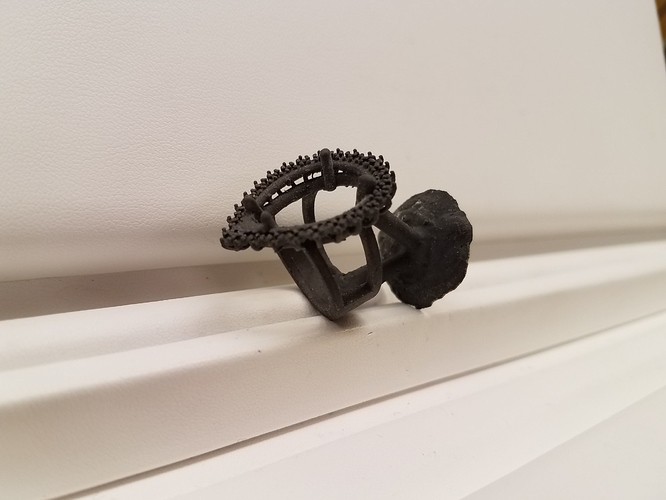
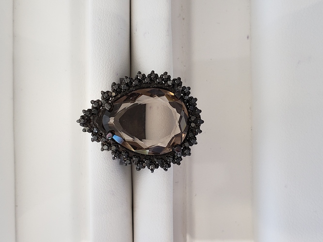
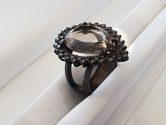
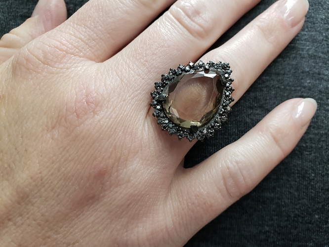
Good afternoon, Orchid Community! Once again, it’s always a pleasure to post here. I have been dying to finish this piece and I finally had the opportunity to do so on my day off. This was supposed to be a graduation gift for my girlfriend, but I got so swamped in work, I put off casting it until a few weeks ago. I finished it Wednesday and presented it to her yesterday for her birthday. She absolutely loved it. To be quite frank, it’s the best piece I’ve ever made, and it broke my heart to give it away! She’ll wear it well.
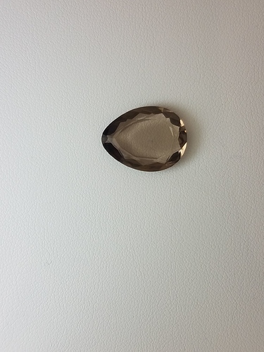
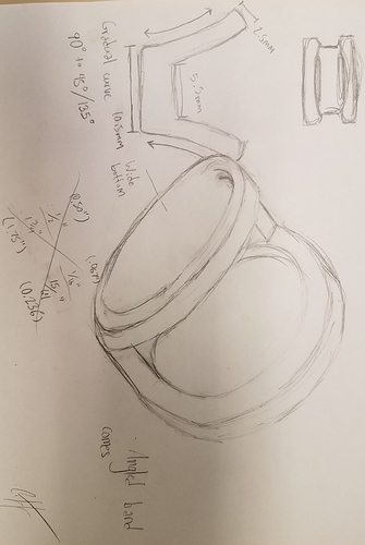
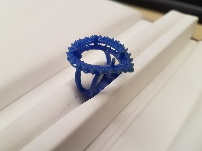
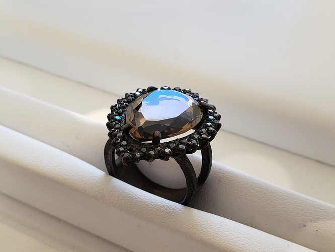
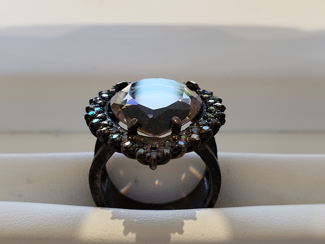
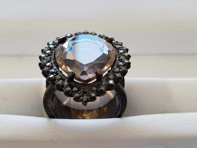
I drew inspiration for this ring from 17th and 18th century baroque jewelry and other design elements of the time. Baroque focuses heavily on extravagance and bombastic, royal opulence. Baroque treads a very fine line between ostentation and elegance. The ring is oxidized sterling silver and has quite a bit of heft to it (I swear I’m not trying to be trendy). The most obvious feature about this ring is the large 22ct custom-cut, pear-shape smoky quartz set in the center. This is such a wonderful focal point to the piece and I wanted everything else to be minimal compared to it. The 50 melee around it are .01ct natural black diamonds (fun fact: I actually dropped 30 of them before setting by accidentally grapping the wrong end of my bag and overturning them. I spent two hours picking every single one up and never dropping them again). The zig-zag halo is honestly my favorite part of this piece, even though it was the most time-consuming and most difficult thing to design in CounterSketch for a rookie like myself. The stones are very nearly mashed into the tiny heads, because it printed in such a way that every other prong was fused to the next head’s prong, so I had to split almost every single prong to make sure that each stone had four prongs. The shank is also one of my favorite pieces, but I don’t feel like it flows with the piece well enough. It’s almost just stuck to the bottom, but I definitely don’t hate it. I had to make two separate rings, tilt them, and add a curved, wide piece fused to them in CounterSketch to make it. As a newbie to the industry and only 23, I have to say that this is the best thing I’ve ever made. I will not display false humility, because it’s one hell of a pretty piece and I truly hope you all like it. I am also, as always, open to criticism and advice. I am always seeking ways to improve my craft and methodology, so please don’t hesitate. On to the photos!
Great job!
Oh my gosh! Gorgeous!!!
Lovely ring, the baroque period has my favourite music too. Best sub genre of classical IMO 
Thank you all so much! I appreciate the support!
Hi Austin, sorry to rain on your parade but you did ask for criticism and advice so I’ll tell you what I think.
The cutting on that quartz is just awful.
Did you have it cut? If so you deserve a refund.
I see meets that are overcut and some that are undercut, and that enormous window that reflects no light internally shows that the cutter is not skilled or just didn’t give a damn.
Any stone cut to ideal proportions will have a pavilion deeper than the crown meaning you couldn’t use a faceted stone that size for the ring as the pavillion would dig into her finger.
That ring design is better suited to a cabbed center stone.
You should look for another cutter that can give you a stone worthy of your work.
The last picture appears to show the stone sitting on the metal not allowing the girdle of the stone to sit flush with the metal on the sides causing the gaps seen in pics 4,7,8 and 10.
Using a cone or bud burr to remove some of the metal would allow your stone to sit flush (looks much better) and lessen the chance of breaking the stone when setting or being worn.
I hope I haven’t offended you as that is not my intent but to point out some things that will allow you to make the highest quality jewelry possible.
Jim
You haven’t offended me at all, Jim! I always welcome criticism. It makes us better at what we do. The store that I work at ordered some colored stone jewelry in on memo from a brand called Royal Jewelry. They had a 14KR piece with this exact stone and I actually loved it, despite not having any of the qualities of an ideally proportioned stone, so I ordered one to be cut exactly like it! As far as the stone setting high, you’re completely right. That was my failure in the design process. I learn more every day and I thank you for the advice!
Congratulations, it looks lovely on her finger!! Sweet.
Thank you very much!
I agree with Jim, the first thing that hit me as a faceter turned newbie silversmith was the huge window on the stone. If the crown were recut with apex facets (no table, just shallow crown facets at 5 to 10 degrees) there would be more light return, as apex facet allow pavilion facets below the critical angle. IDK if this would completely eliminate window, because the stone is very shallow. I (or the recutter) would need a stone depth to calculate the angles, but this might be an option. HTH, royjohn
…
Because you are a stonecutter, I can imagine the frustration seeing a stone cut in such a non-traditional way, against the industry standard, if you will. I just happen to absolutely love it!
den
Hi Austin,
Everyone is entitled to their own taste, after all, some folks even like “Mystic Topaz,” which to me looks very cheap. But I’m curious as to what about this windowed stone grabs you. Thx, royjohn
I’d worry that if the seat was carved out to fit that stone, it would sit too low relative to the halo. I would bring the gallery rail in the CAD up higher to support the stone and give it the height I think it needs to stand above the halo.
I do agree with you as well regarding the cut. The only time a window is acceptable is if the color saturation of the stone is so good that it outweighs the lack of light return. Even then, I still find it difficult to look at the stone without thinking that it could have been cut better.
Of course, these are just my opinions. 
I actually like its cut as it is. Mainly because the light can get in from underneath and illuminate it a bit
I just love how much light passes through this stone and the rich, brown color. I am currently finishing my GIA colored stones essentials course, so I am learning about faceting, symmetry, and light return, so I understand how this cut would bother some people. It’s an unorthodox cut, but perhaps I just can’t properly explain why I love it. Like I said, my store got some colored stone jewelry in on memo a few months ago, I saw a 14K rose gold ring with this exact stone, and I knew I had to make a ring with that exact stone. I contacted a stonecutter, sent him pictures and measurements, and he cut it. I think there was a miscommunication on this post and that I may have accidentally portrayed the stonecutter as an amateur, but he simply replicated the stone for me.
That’s how I felt exactly!
I’m not a stone cutter, so I have no idea about the cuts, but just looking at it I think it’s beautiful. I love the oxidization on the sterling silver, the sparkly black diamonds and the nice brown from the quartz. Really great piece!
I am a stone cutter both faceting and cabbing so I know good cutting from bad, that is why I spoke up in the first place.
While shallow cutting is not the norm it is becoming prevalent in some jewelers lines.
Once you finish your GIA course you will understand why the quartz is not a well cut stone but that is beside the point, what matters is that you and your lady are pleased, if she is happy you did well.
Best regards, Jim
I appreciate the input, truly. I learn more and more about this industry from my superiors, my coursework, and from you wonderful people in this community. The lady is beyond pleased and I’m proud of myself for accomplishing this. I must ask, though, if you have the time, could you post a picture of a pear-shape quartz (smoky or otherwise) cut in such a way that you would find fitting for this setting?
